Project ratings in Orange
A 2019 exploration by Lawrence Rowland. Explanation reviewed 1 October 2026.
Could a portfolio manager learn from completed projects to decide which current projects deserve a closer look? This walkthrough uses World Bank project records to make the steps visible: prepare the data, compare classifiers, inspect mistakes, explore patterns, and consider what a prediction could change in a monthly review.
The original name was Project Success Prediction. The actual target is IEG Bank Performance, a rating of the Bank’s contribution to preparation and supervision. It is distinct from project outcomes or benefits. Predicting this rating from completed-project records does not yet establish an early warning system.
Methods guide · Library · Repository overview
Read the workflow
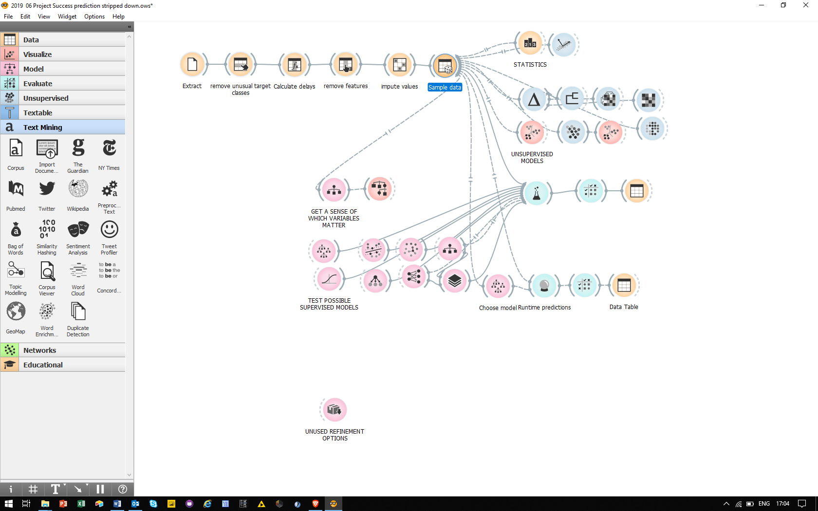
Original June 2019 workflow overview. Follow the top row from Extract to Sample data, then follow one branch at a time. This wider illustrated version includes experiments absent from the smaller saved workflow file.
- Prepare the records, and ask whether each feature would exist when a forecast is needed.
- Read the results, then inspect the confusion matrix rather than relying on one headline score.
- Explore the records, then distinguish a suggestive pattern from a cause or a management decision.
- Read the proposed management use, with the original unfinished ideas retained below it.
Resources
- Original demonstration film — about 4 minutes 38 seconds. Download the MOV file if your browser does not play it.
- One-page demonstration script — July 2019 (PDF).
- Saved Orange workflow (.ows).
- Orange downloads and widget documentation.
To reopen the model: the .ows file describes widgets and connections; it does not contain the training data or a fitted model. It references a local workbook, 2019 World Bank projects MasterDataFile20190305.xlsx, which is absent from this repository. The screenshots, script and film remain readable without Orange. Reproduction requires recovering a suitable data snapshot, reconnecting it and checking the saved settings against the installed Orange version. The workflow has not been rerun for this review.
Purpose
Use a concrete portfolio to understand how machine learning might help focus management attention. The demonstration was an independent exploration of public data, not work commissioned by the World Bank.
Exec Summary
The retained result is a visual account of model building and interpretation. The screenshots record a Random Forest classification accuracy of 0.897 (89.7%) across 667 evaluated records. Earlier prose rounded this inconsistently to 89% or 90%. This is a historical displayed result, not a reproduced score or a production target. The sample includes completed-project information and other evaluation ratings; those make its usefulness for early prediction unresolved.
Introduction
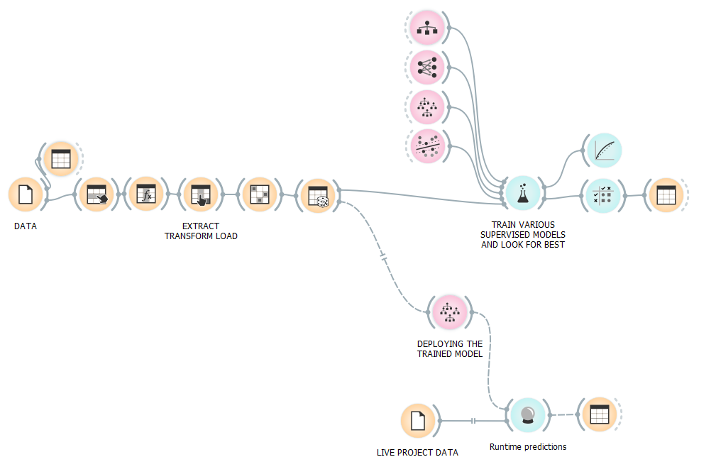
The original account describes an archive of roughly 12,000 World Bank project records, with about 20 attributes per record. It used categories such as Satisfactory and Highly Satisfactory as classification labels. The saved selection settings name IEG_Bank_Perf_Rating as the target. These are ratings, not a binary success/failure label.
IEG defines Bank Performance through quality at entry and quality of supervision. Both constituent ratings also appear among the example’s features. A model can therefore learn to reconstruct an evaluation from related evaluations without demonstrating an ability to anticipate it. See IEG’s rating definitions.
Main results
The selected Random Forest is the strongest of the classifiers shown in the saved comparison. The confusion matrix below contains 598 correct classifications out of 667. Of 309 predictions of exactly Satisfactory, 281 match that recorded label; another 15 records labelled Satisfactory are classified elsewhere. “Other than Satisfactory” includes better as well as worse ratings, so it must not be equated with failure.
Those counts help explain precision and recall. They do not establish how a model would perform on future projects, another institution, or information available early in delivery.
Data
The original write-up linked to the Kaggle copy of the IEG ratings. The official IEG ratings page now supplies a maintained data source. Neither link is evidence that a current download reproduces the missing 2019 workbook: the original prose mentioned an April extract, while the saved workbook name contains 20190305.
Here is the original sample record, with its field names and values retained. The date numbers are spreadsheet serial values, not durations. The negative commitment amount is retained as recorded, not validated here.
| Project_Name | ELECTRICITY GENERATION REHAB & RESTRUCTU |
| IEG_Bank_Perf_Rating | SATISFACTORY |
| Approval_FY | 2006 |
| CANCELLED_USD_AMOUNT | 419,815,830 |
| NET_COMMITMENT_AMOUNT | - 83,815,830 |
| ProdLine | IBRD/IDA |
| LendingInstr | SIL |
| Agreement_Type | IBRD |
| FragileState | IBRD non-FCV |
| Eval_Type | ES |
| Eval_FY | 2011 |
| CLOSING_DATE | 40908 |
| REV_CLOSE_DATE | 40908 |
| Approval Date | 38874 |
| Deactivation_Date | 40137 |
| IEG_Outcome_Rating | NOT RATED |
| IEG_Bank_QAE_Rating | SATISFACTORY |
| IEG_Bank_QOS_Rating | SATISFACTORY |
| IEG_ICR_Quality_Rating_Modified | SATISFACTORY |
The forecast date matters. Evaluation type/year, eventual cancellation, revised closure and final review ratings may contain information unavailable at a project decision point. The saved input selection includes Outcome, quality-at-entry, supervision and ICR-quality ratings. In particular, quality-at-entry and supervision ratings help define the target itself. An early-warning study would need features available at a stated cutoff and evaluation on genuinely later projects. Simply holding out rows from a completed-project archive does not resolve this information leakage. See scikit-learn’s guidance on data leakage.
Extract, Transform and Load the data
The original demonstration selected the Bank Performance rating, filtered some uncommon target classes, constructed a delay feature from closing dates, removed selected columns, and used the Impute widget to remove incomplete rows. Dropping rows and classes changes the population to which the result applies; it is not merely a speed improvement.
The account describes a 10% sample for a faster demonstration. The pictures and saved workflow represent different snapshots: the comparison uses 667 records, while the tree view below shows 2,000. The saved sampler is set to 18%, rather than the narrative’s 10%, and it retains two derived features: closing date minus revised closing date, and elapsed time from approval to deactivation. The first difference is not automatically a positive delay. Do not read them as one fully recoverable run. The saved .ows contains 20 widgets; the larger canvas above records additional exploration.
Train various supervised models and look for the best (test and score)
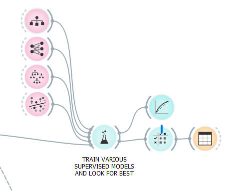
The original account reports testing five further models before showing these four. The widget compares learners under a chosen sampling procedure. That is different from testing a finished model prospectively in a live portfolio. See Orange’s Test and Score explanation for the meaning of its evaluation choices.
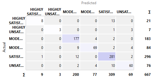
Read a mistake as well as a success. The diagonal contains matching labels. In the Highly Satisfactory prediction column, 8 of 9 match; the remaining record is Satisfactory. Another 13 actual Highly Satisfactory records were predicted as Satisfactory. Whether that distinction matters depends on the management question, not just the total accuracy.
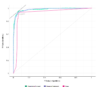
ROC correction: the vertical axis is sensitivity (true-positive rate); the horizontal axis is false-positive rate, 1 minus specificity. The earlier text called the horizontal axis specificity, which reverses the meaning. Here “positive” means the selected class, Satisfactory. The upper-left corner would detect all members of that class with no false positives. Orange’s ROC documentation explains the class and threshold choices.
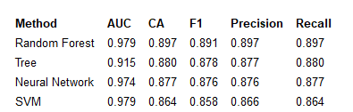
What the scores mean. Accuracy is the fraction of labels predicted correctly. For a chosen positive class, precision asks how many positive predictions are correct; recall asks how many actual positives are found. F1 is their harmonic mean. AUC summarises ranking discrimination over thresholds. With several classes, the averaging convention matters: the row above is not simply the Satisfactory-only calculation from the matrix.
Data exploration, beyond the classification model
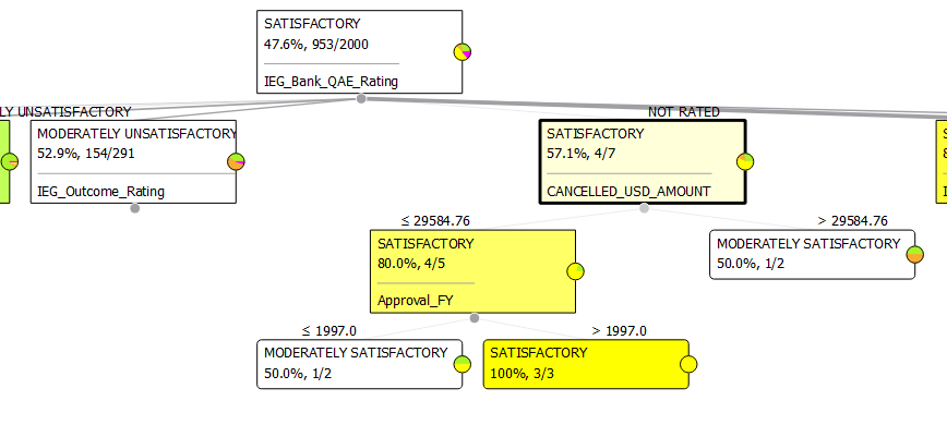
Prediction and explanation answer different questions. A tree can expose which recorded attributes separate ratings. Here it branches on quality-at-entry rating and cancelled amount. One displayed path shrinks to only three records. That is a useful prompt to inspect the data, not a dependable rule for making projects succeed. This tree uses a different sample from the 667-record comparison.
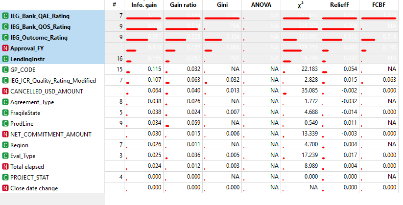
Ranking offers several statistical measures of association with the target. Their scales and assumptions differ. A high score does not establish causation or show that the attribute was known early enough to use. The original notes explicitly left further understanding of these measures unfinished.
Unsupervised learning
The exploration also asked which records look similar, without using the rating as the learning target. Distances, selected features and scaling determine what “similar” means. The original account says categorical features had not yet been included in this branch.
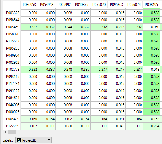
Distances turn selected project attributes into a measure of resemblance.
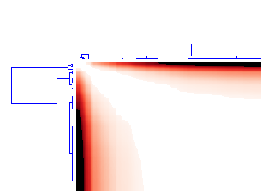
The reordered heatmap and dendrograms expose patterns in the computed similarities. The original account described four main clusters; this picture does not mark a four-group cut.
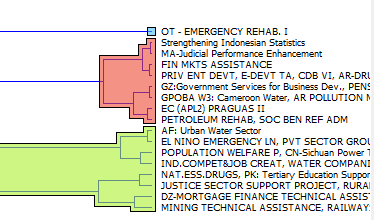
Inspect records within a group to see whether the resemblance has a useful project interpretation.
The original notes also mention k-means, t-SNE and FreeViz. K-means forms groups under a chosen distance; t-SNE is an embedding for inspecting local neighbourhoods. FreeViz uses class information, so it should not be described as an unsupervised discovery of performance groups. See Orange’s FreeViz description.
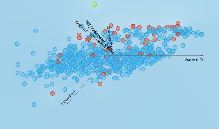
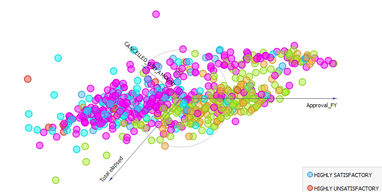
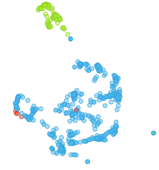
These three retained views show different projections. The old prose and picture order do not establish an exact one-to-one mapping to the named methods or their settings. The original suggestion of two groups and an outlier remains a visual observation to investigate, not a validated project typology.
Deployment for Client Portfolio Management
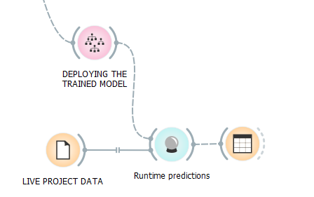
This was a proposed operational use, not a delivered service. The saved workflow’s connections into the deployment branch are disabled. It does not demonstrate a working live feed or retained fitted model. The original AI-canvas questions remain useful for deciding what a future application would need to accomplish:
- Prediction: choose the exact rating or outcome and the date at which it must be forecast. An early warning of an adverse outcome requires a different, explicit target from “exactly Satisfactory”.
- Judgement: define the positive class before discussing error costs. If positive means “needs review”, a false positive sends an otherwise satisfactory project for review; a false negative misses a project needing attention. The earlier assertion that false negatives are inherently less serious is unsupported. Review and cancellation are also different actions.
- Action: review, provide support or resources, re-scope, monitor, or consider cancellation with the responsible decision-maker. A rating prediction alone does not justify any of these interventions.
- Outcomes: assess useful decisions and realised benefits as well as prediction errors. The old proposed 90% accuracy and “over 50%” success at identifying failure were not established acceptance criteria. A majority-class baseline, error costs and workload would need to inform them.
- Input: the proposal envisaged monthly project updates. Features must exist at that month’s cutoff; eventual delay or later evaluations cannot quietly stand in for forecasts.
- Feedback: a six-month retraining cycle was suggested. Its cadence, data changes and validation would need to be assessed rather than assumed.
- Workflow impact: focusing reviews, improving scoping and reallocating support were hoped-for benefits. “One day a month” was an estimate, not a measured operating cost. There is no evidence here that using the model improved delivery outcomes.
The distinction worth carrying forward is record → prediction → judgement → action → observed outcome. The arrows between those steps require their own evidence.
Further developments (making it better and broadening the Use Case)
The original development list is retained below as a historical record of open questions, not a current research programme. Its statuses have not been advanced by this editorial review. One correction to the NYC suggestion: daily data could support time-aware evaluation, but does not by itself remove hindsight bias.
| Improvement and applications | Benefit | Status |
| Spend more time understanding the different project reviews, to understand whether Performance review is the best one or whether Outcome review is better. | Check we have understood the problem correctly | Not reviewed |
| Try a simpler Classification into Successful, unsuccessful | Simpler, makes more sense to client | Not tried, but possible in Orange |
| Remove the intermediate project reviews to see how much might be explained without these. | Understanding | Not started. |
| Understand Ranking statistics better | Training | Very rusty with this. |
| Spend more time testing and optimising across different samples, and reviewing the accuracy. | Optimisation | Not really started |
| Stack models | Optimisation | 1st trial showed small improvement |
| Try to add Categorical features into the Unsupervised learning | Broader Use case | Needs some thought |
| Worth looking again at Principal Component Analysis | This was not effective in explaining much of the variance | 1st trial |
| Extend application to large projects w multiple work packages, starting from WBS data | Scale | Not started |
| Extend application to supplier management for services. | New use case | Would need a little thought |
| Unsupervised learning: network analysis of the project clusters, once categorical information has been included. | Broader offering | Need some thought |
| Save the trained model | Makes move into Production better | Witnessed but not tested |
| Review the Project Success literature in IPMA | Broaden and contextualise the offering | Have seen relevant articles |
| Test the NYC data set since this has daily data | Would remove hindsight bias | Dataset found. |
| Extend to other datasets and clients | Generalisability | Not started |
Sources and review boundary
Original screenshots, film, PDF and .ows are unchanged. The June 2019 canvas title and July 2019 script place the demonstration in 2019; the PDF and film were exported in February 2020. This 2026 review repairs navigation and explanations, and inspects the saved artefacts. It does not retrain a model, reproduce its metrics, test Orange compatibility, or establish a deployment.
Data and rating interpretation come from IEG; the modelling interface comes from Orange. The proposed operational questions use the AI Canvas of Agrawal, Gans and Goldfarb (2019).